The brand language for Gabin was developed to communicate trust, stability, and meticulous control, reflecting its core business of commercial property risk assessment and management. The design process focused on synthesizing these abstract concepts into a clean, modern, and precise visual identity. The outcome is a cohesive system where every element reinforces the company’s professional authority.
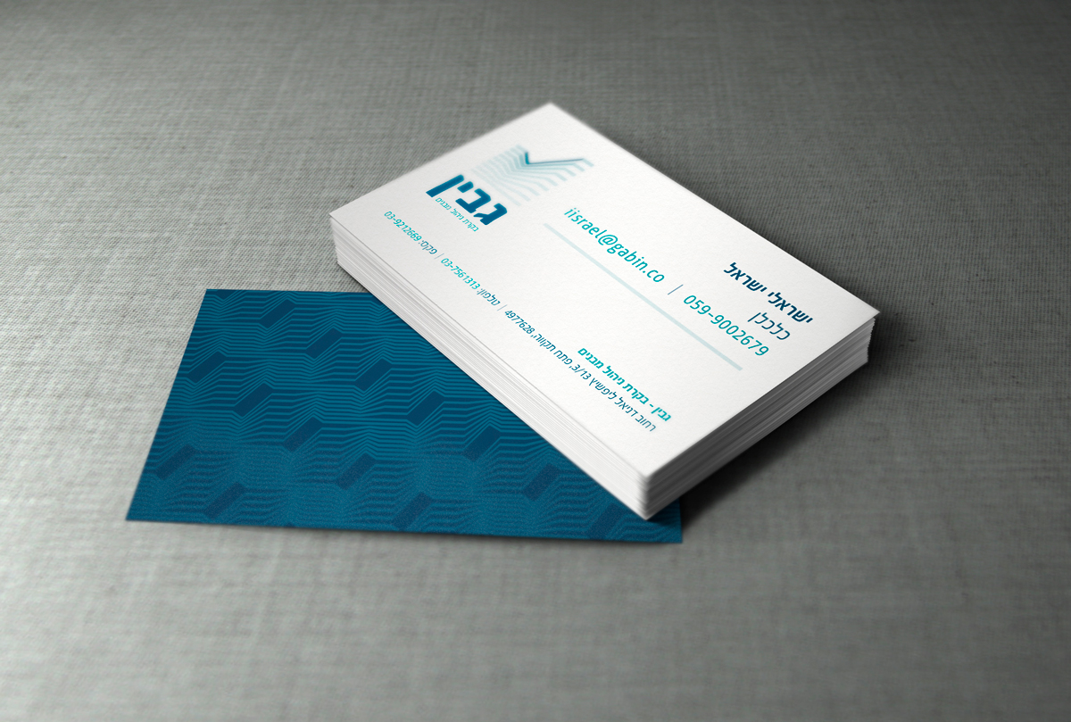
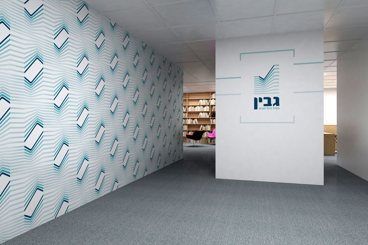
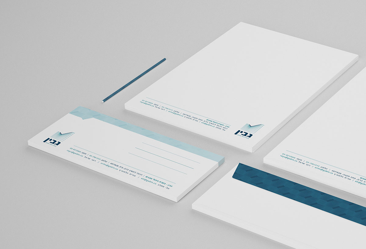
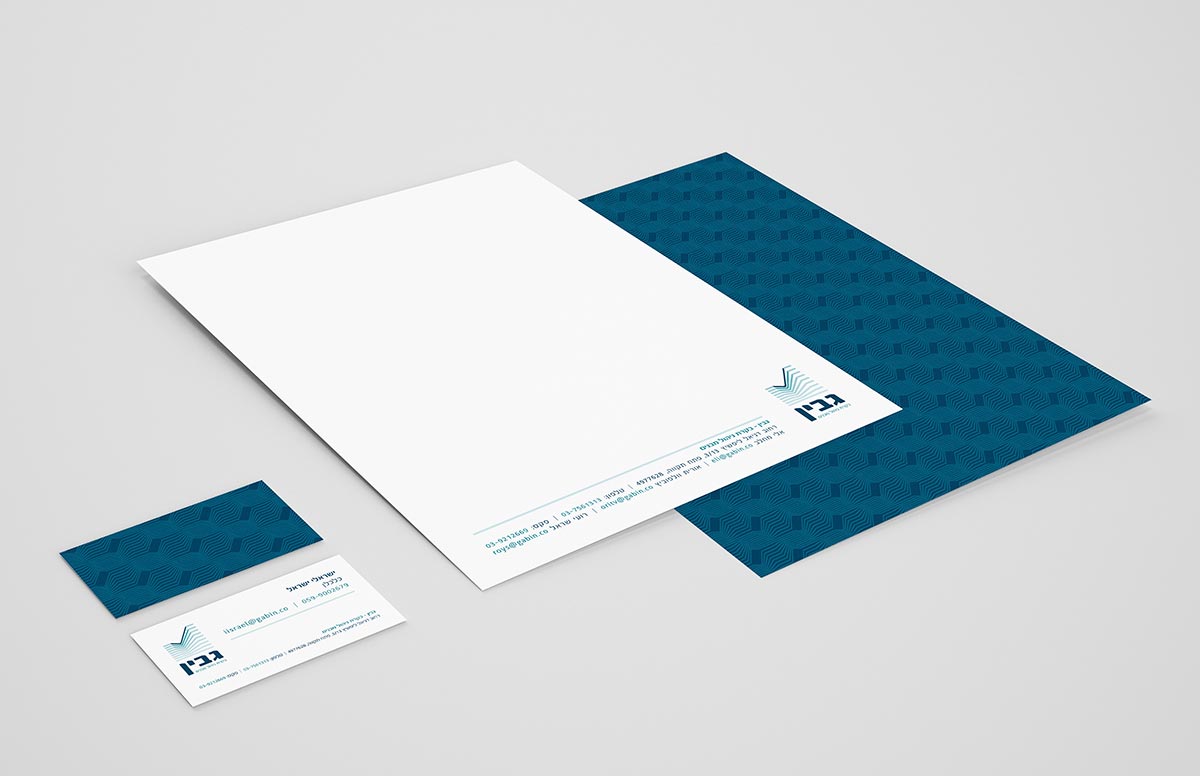
The logo is the cornerstone, ingeniously merging a checkmark (✔), symbolizing validation and approval, with the abstract form of a building or rising structure. This dual imagery instantly conveys the function of oversight and success in the real estate domain. The sophisticated palette of deep blues and teal accents was chosen to establish a feeling of corporate reliability and calm expertise.
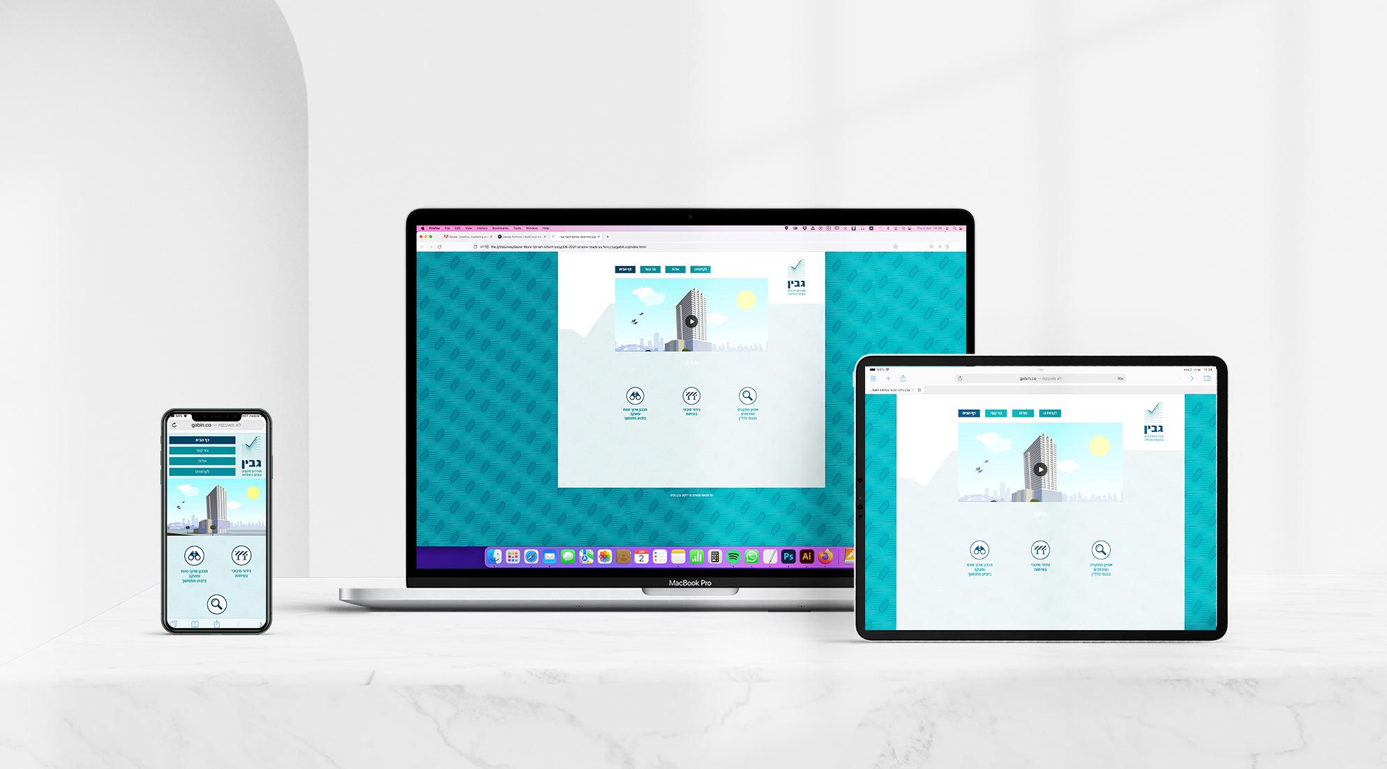
The brand language extends seamlessly to all applications, creating a unified experience. A custom, diagonal geometric pattern was created to add dynamic energy and visual interest across walls and collateral, contrasting the steady logotype. This controlled use of pattern and color ensures that Gabin's identity remains consistent, whether seen on a letterhead or as large-scale office decor.
![]()
- Categories:Brand Identity
- Date:2018
- Client:Gabin