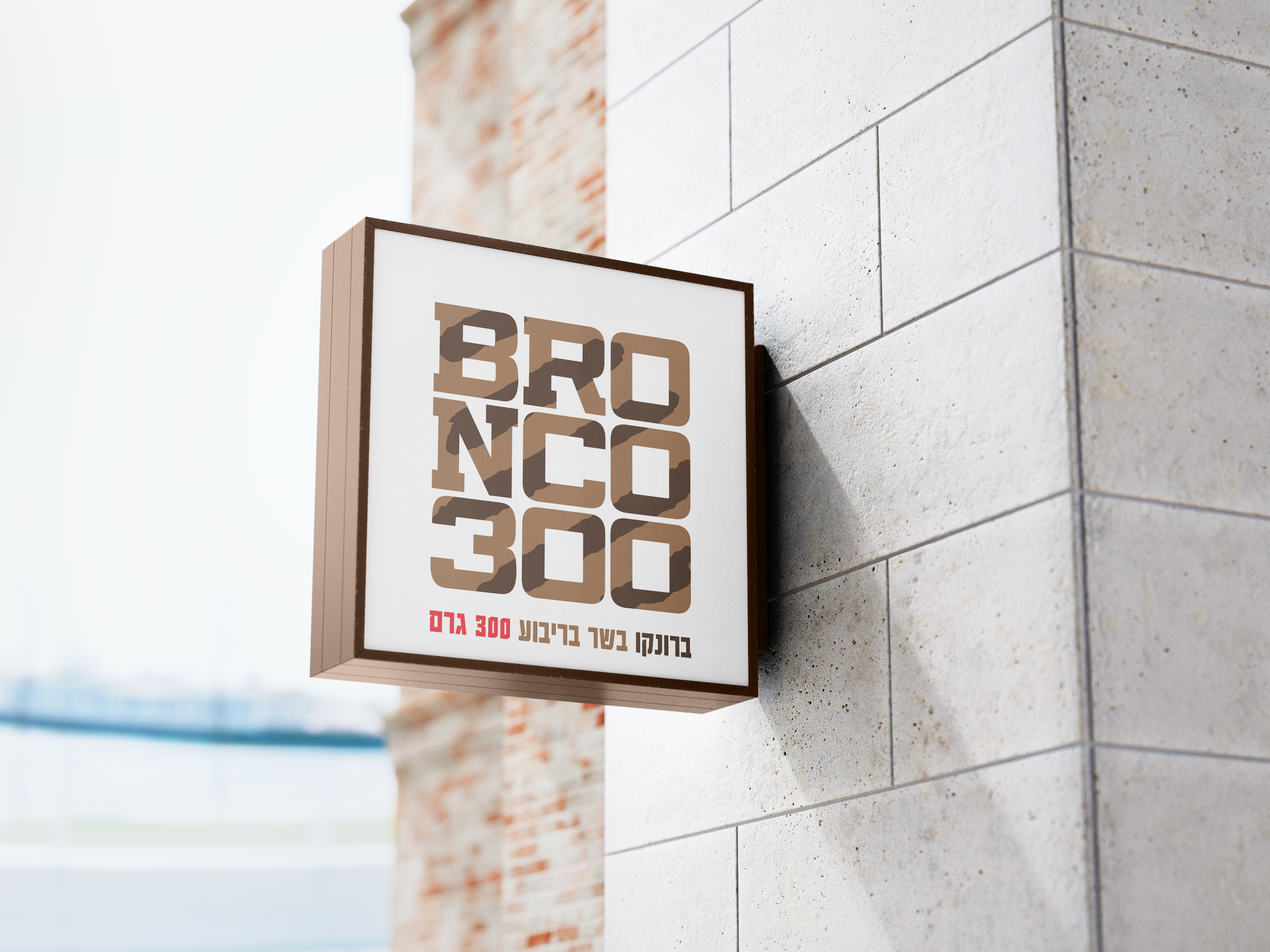
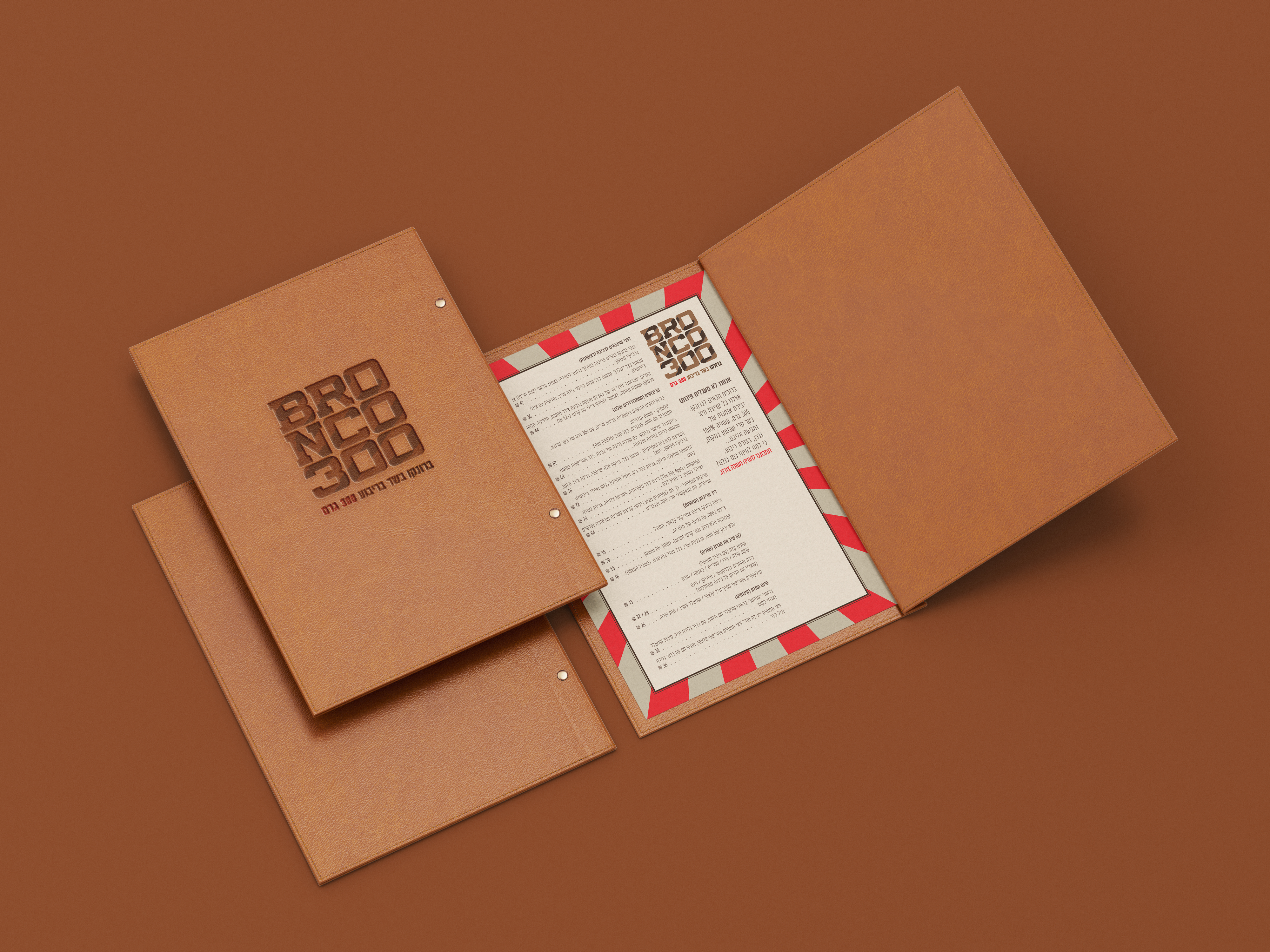
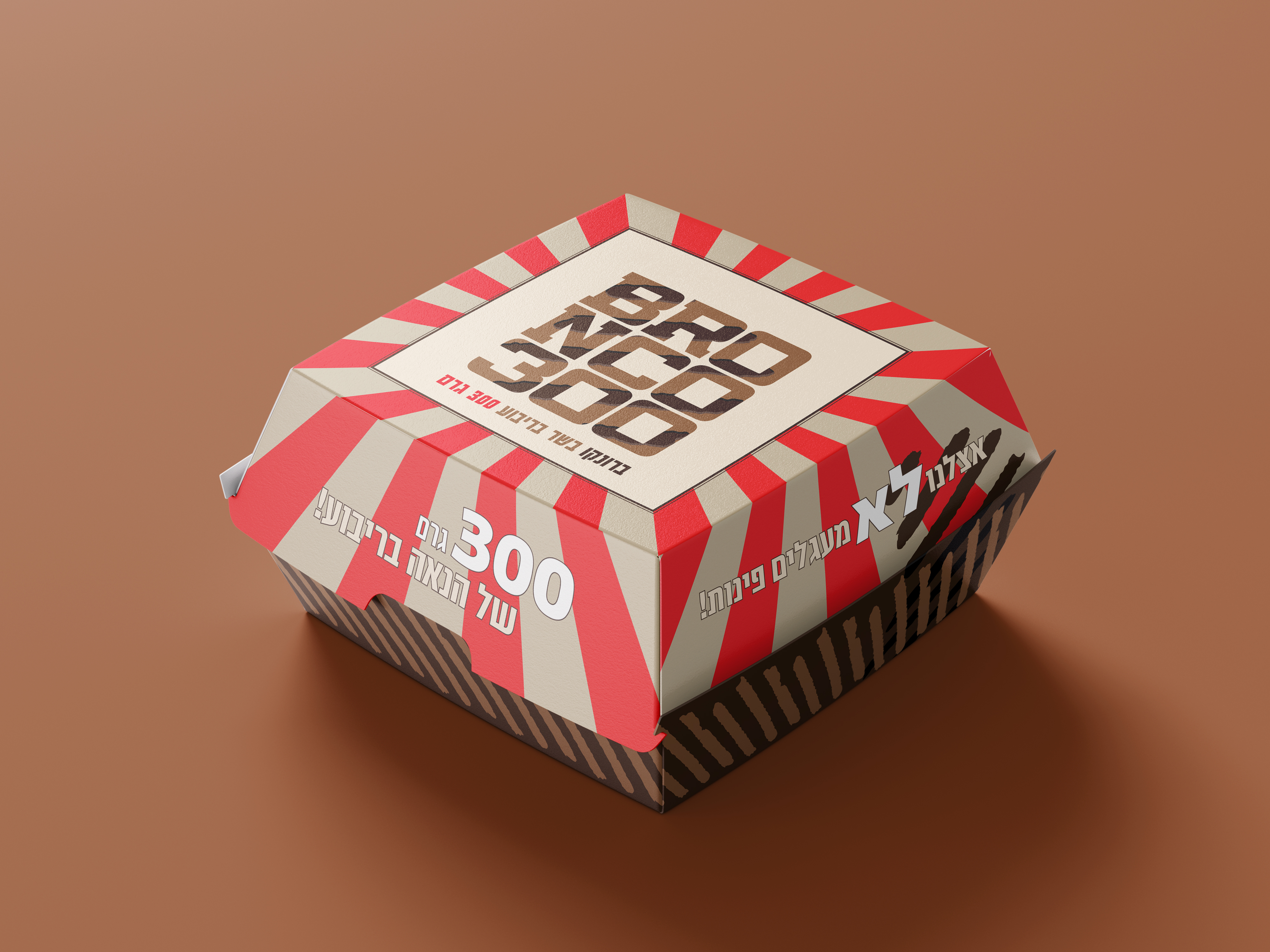
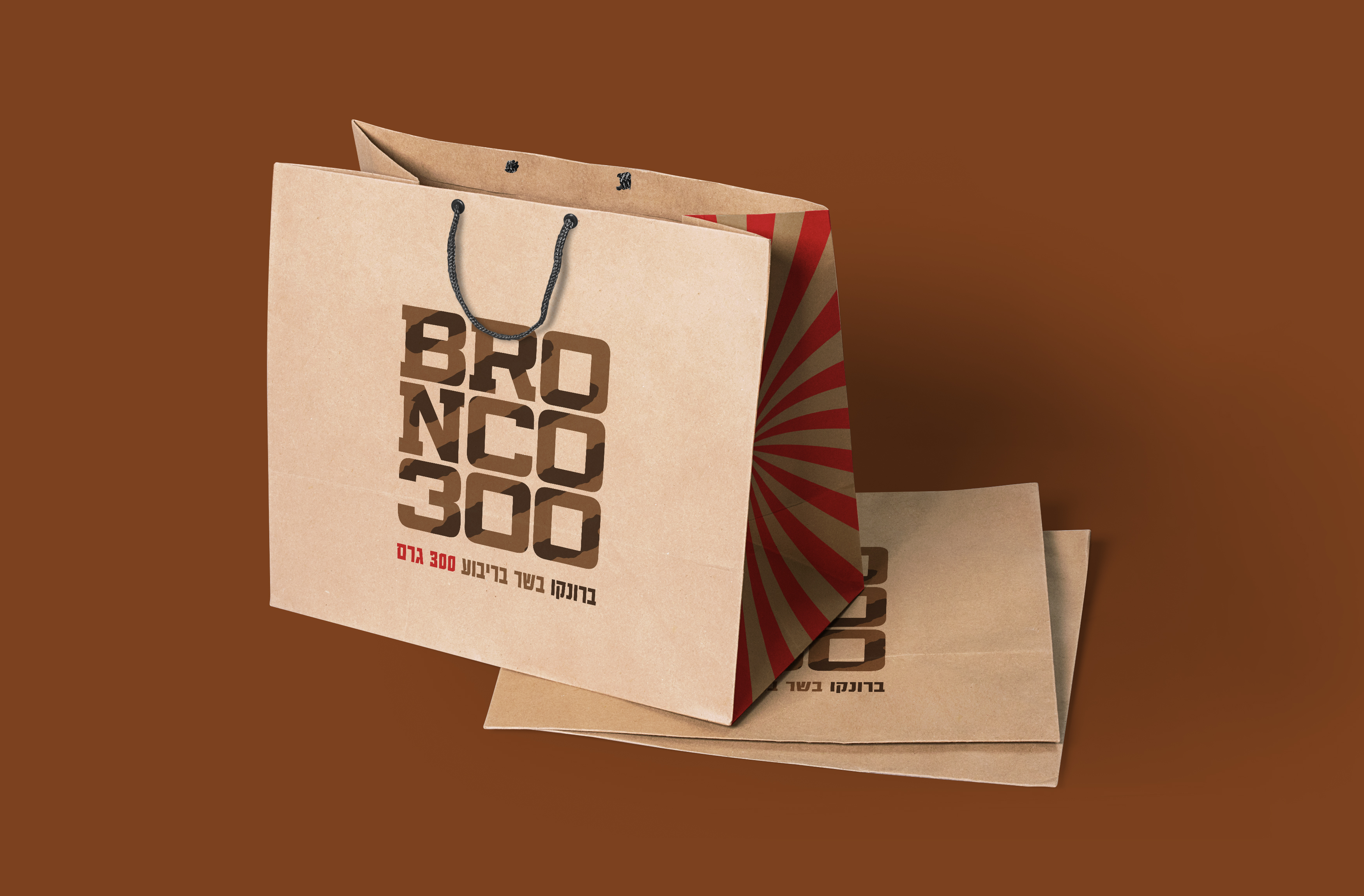
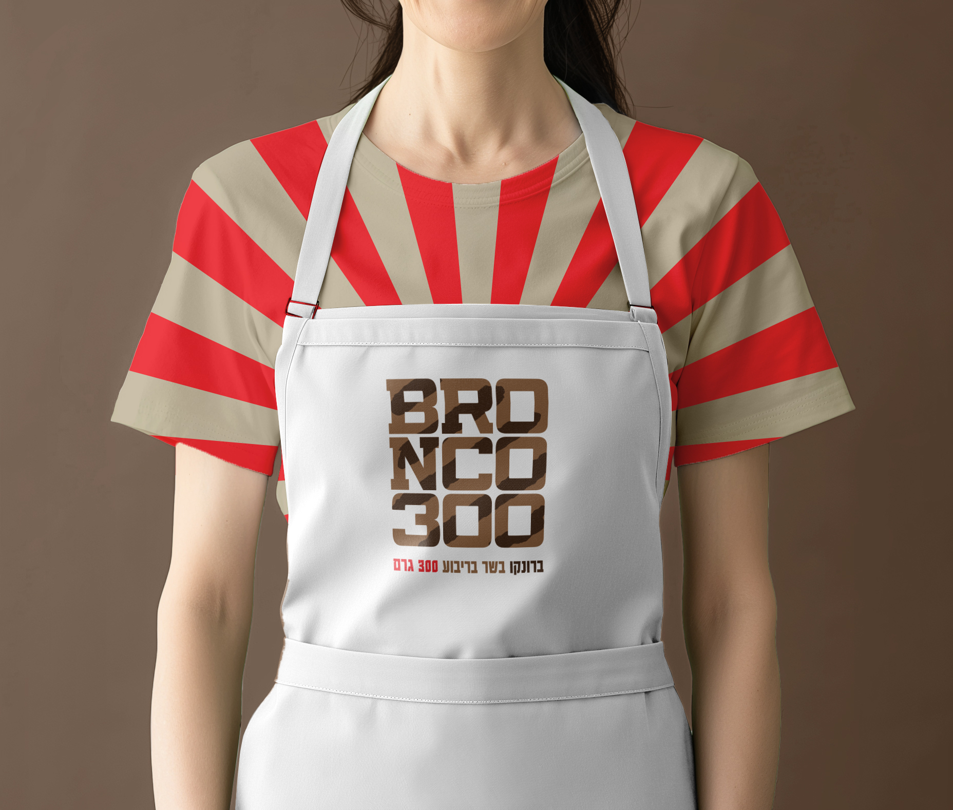
We developed the brand design for Bronco, a burger restaurant with a bold twist — their burgers are square. This unconventional detail became the heart of the visual identity, symbolizing Bronco’s refusal to conform to the expected “round burger” standard. The design celebrates strength, simplicity, and authenticity — qualities that reflect the brand’s promise of real, uncompromising flavor.
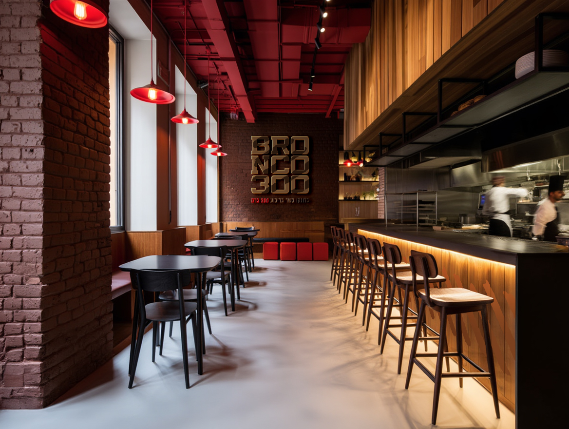
The graphic language draws from the geometry of the burger itself: clean lines, structured typography, and a square-based logo composition that feels powerful and self-assured. A red-and-beige color palette with grill-inspired patterns conveys heat, energy, and craftsmanship. The design — from the box to the outdoor sign - echoes the same straightforward attitude: what you see is what you get, and what you get is damn good.
By embracing the square burger as both a visual and conceptual anchor, we created a brand identity that’s instantly memorable and unmistakably Bronco. The result is a cohesive, confident system that stands out on the street, on social media, and in customers’ hands — a design that’s as bold and satisfying as the food itself.
- Categories:Branding Identity
- Date:2023
- Client:Bronco 300